In this blogpost series, we discuss our 3 participatory design workshops about social media. The first instalment of the series provides an overview of the research activity. The second instalment is dedicated to workshop 1. The third blogpost is about workshop 2. This fourth one discusses our third and final workshop.
Workshop 1 was mostly about the present of social media. Workshop 2 travelled far into the future, to speculate about what social media should be. Workshop 3 jumped back in time, to our immediate future. During workshop 3, we worked on a brand new social media platform, one conceived by autistic designers rather than neurotypical ones.
Designing with cards
During workshop 3, participants were tasked to come up with features for a new social media platform. A feature was something they would like the new social media platform to do.
To help them structure and communicate their features, we provided them with a set of design cards. There were 3 types of cards: blue cards, orange cards and blank cards.
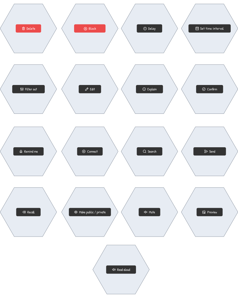
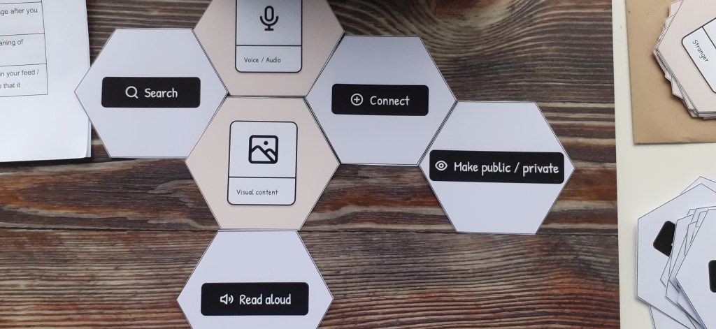
The blue cards
The blue cards represented actions, i.e. things we do in social media. They featured a big button in the middle with a label.
These cards included actions like ‘explain’, ‘recall’, ‘remind me’, ‘mute’ or ‘send’. You can see all 17 blue cards below.
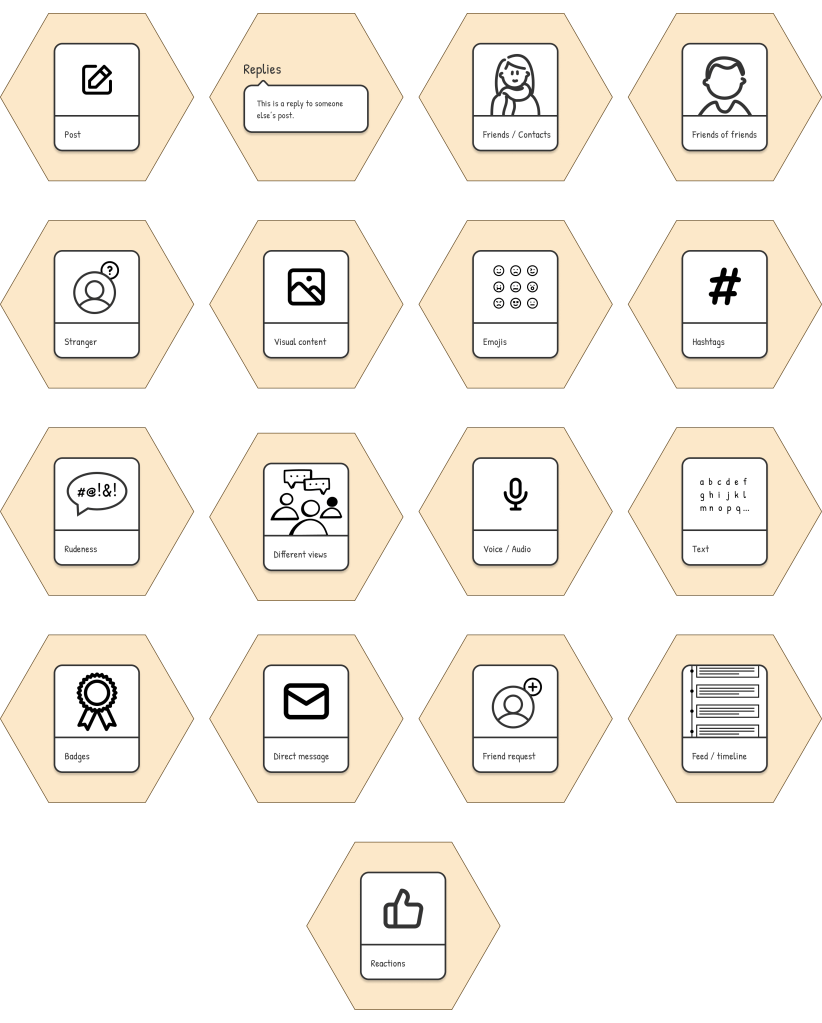
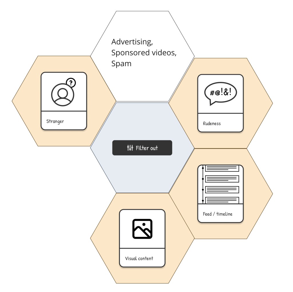
The orange cards
The orange cards represented components, i.e. objects or entities that exist in social media. They featured a labelled illustration.
These cards included components like ‘friends’, ‘posts’, ‘emojis’, ‘hashtags’ or ‘replies’. You can see all 17 orange cards below.
The blank cards
The blank cards were white and their front was completely empty. Their purpose was allowing people to add actions and components that were not covered by the blue and orange cards. Participants could write on them anything they wanted.
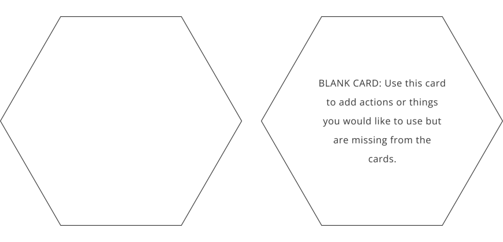
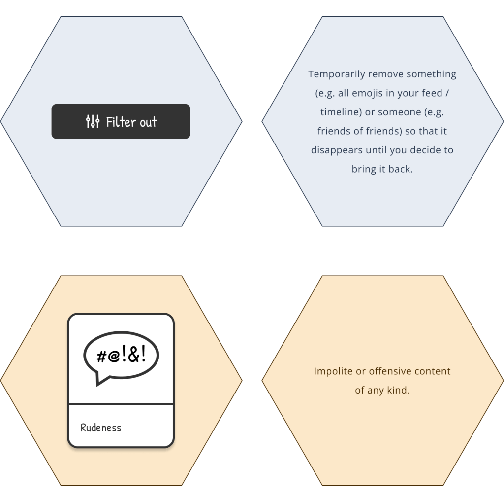
As you can see in the blank card above, all cards had a short explanation on the back. Below you can see the front and back of an orange and a blue card, with their respective explanations.
The feature-making rounds
During the 2-hour workshops, we did 3 rounds of feature making. A round lasted about 25 minutes, and we took a break after each of them.
A feature-making round started with participants working individually on a feature for 10 minutes. This involved coming up with the feature idea, composing the feature with the design cards, and giving it a title.
After the 10 minutes had passed, each participant explained their feature to the group. There was also a little time for discussion, questions and clarifications.
To create their features, participants could use a cardboard version of the design cards they received by post.
Participants could also use a digital version of the design cards available on the digital whiteboard.
The features
Participants came up with an astounding total of 38 features: quite an achievement. The features included all kinds of functions and utilities, but a common theme across all of them was reclaiming control over our social media platforms. Participants created features to give us more control over what we see on social media; over who sees our content and profile information; over how much time and effort we spend on social media; and over how the social media platforms look like.
For example, one of our participants proposed a feature called “Activate stillness”, a calm view mode that would remove all moving images, videos and sounds from the social media feed, leaving only still images and text.
Another participant suggested a voice preview feature. This utility would read aloud your posts before you send them, so that you can actually hear how they sound when they are spoken. That way you would be able to edit and tweak them until they sound the way you intended.
A third participant wanted to set a time interval after which all her posts, reactions and replies to others would be deleted.
A fourth wanted to mute certain types of content for a period of time, in order to match the content they saw on social media to their mental energy and capacity at any given moment. Examples of content they would like to mute temporarily included posts by strangers, conflicting views and tense arguments.
From our participants’ features, we can tentatively conclude that users’ lack of control over how social media works and behaves is one of the major design flaws in existing platforms.
What about you? What kinds of features would you like to see in a new social media platform? Tell us by leaving a reply.

One thought on “Workshop 3: Designing a new social media platform”